Creative loner and form-finder
I’m Arnout Visser, a form-finder with a passion for glass and I develop concepts that I then translate into a design. I like working with glass: with a good glassblower and a clear-cut idea you can make the most wonderful things. No other material possesses this quality and glass has spectacular physical guises and properties. At room temperature it’s hard, but from 700 degrees Celsius it becomes flaccid and malleable, and then you can shape it and inflate it. This results in complete, transparent volumes without mountings, so in glass a concept can be realized as clear as a bell. After it has been blown into shape the glass has to cool down very slowly, otherwise it shatters to pieces in front of your eyes.
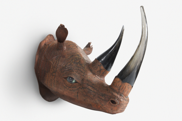
Why a rhino?
Long before humanity existed, the rhinoceros was busy shaping and designing his horn.
Some cultures say rhino horns have mythical qualities or can cure illness. Others carve them into prized dagger handles.
The rhino horn is not to made from ivory or bone. Instead it is highly compressed keratin - the same material found in hair and fingernails. The horn is not part of the skull at all, but attached on rough patches on the rhino's skull. The softer outer portion of the rhino horn weakens with sun exposure and is worn into the characteristic curved point through clashes with other rhinos and by rubbing it on the ground and on vegetation. So, naturally his horn grows straight, but by sharpening it on his favourite tree over and over again, the rhino shaped his horn into the characteristic curved point.
I found it quite fascinating how an animal has been designing long before humanity started to exist. That’s the reason I use a rhino as my logo.

Laboratory
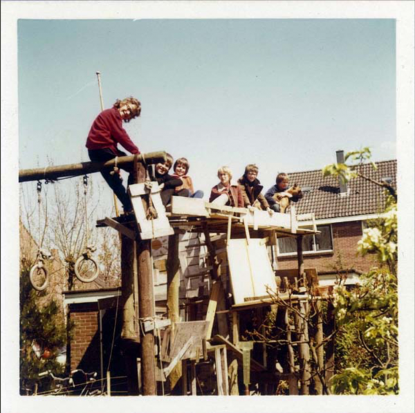
It’s obvious where my love for art and design came from: in my parents’ house there were several sculptures by Carel Visser, one of my father’s brothers, and our furniture was designed by Martin Visser, another of my uncles. We lived in Middelburg, where I first attended school. Because I’m dyslexic, I wasn’t good at languages: spelling was a disaster. Once a German teacher actually asked me, amiably but resolutely, whether I wouldn’t mind skipping her class from then on. I attended a total of four different schools in four towns and eventually took the pre-university VWO state exam. However, I do have creative technical insight. My parents weren’t handy what- soever, so they left all the tech- nical things to me. I remember that I was already repairing electric sockets at the age of eight. I had also equipped one of the rooms in our house as a laboratory, where I cultivated algae cultures and grew salt crystals, which I then studied under my microscope. Things didn’t always go to plan and once there was a huge explosion. I don’t remember how exactly. When I was about 10 years old I built a two-storey hut in the garden. On the first floor I constructed a balcony where I liked to sit.


Counterweight
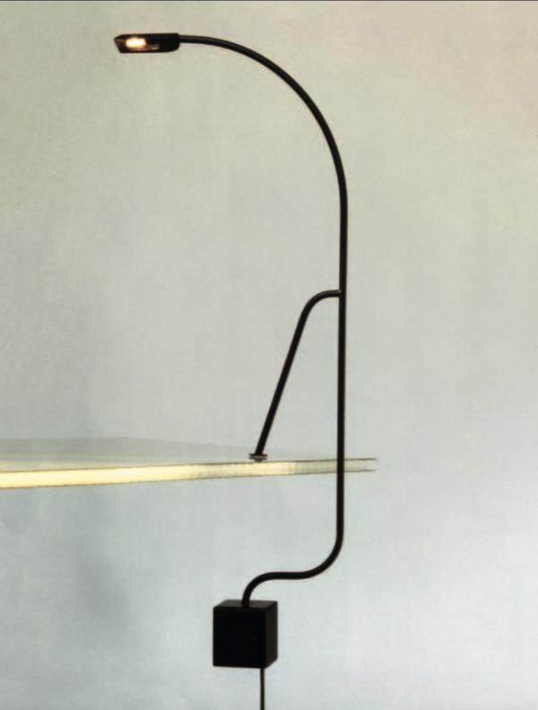
When I was 19 I made the Light Balance table lamp. I used the small halogen bulbs that had just been brought onto the market. These kinds of bulbs work on a low voltage so a transformer is needed, which back then was still a large, heavy block. To turn that disadvantage into an advantage I set it as a counterweight under the table, so that the centre of gravity was beneath the tabletop and the lamp could balance on the table’s edge. I knocked together a prototype of this design in the shed, and took it to several de- sign shops in the Netherlands. They thought it had something and ordered three units in three colours. I then soldered together a hundred models at a squatted warehouse in Amsterdam. That took a lot of work, but fortunately I was helped by a jewellery-maker friend. Then we were polishing for days.
When I was 21 I entered the Light Balance for the Kortrijk Interieur design competition and won second prize. At around the same time I was approached by Harry Swaak, director of Lumiance lighting manufacturers. He thought it was a good idea for a designer to be involved with his company and produced various versions of the lamp, which were given the name Tablo. None of these versions used the transformer as a counterweight; it was concealed in the plug. Lumiance made the lamp from high-tech plastic components which could be clicked together. This meant you had to invest a lot of time on the moulds, but you could then save costs because there was no need for soldering. I had already discovered how tricky it was to produce the lamps myself, and I then also noticed that sometimes lamps were sent back, because there was some- thing wrong with them. Besides, I found designing was much more enjoyable than producing. That’s why I sold the design to Lumiance and decided to apply to study at the 3D Design department of the Academy of Visual Arts in Arnhem.
The Ultimate Craft
In the late 1980s the 3D Design department’s focus was on the development of an idea, the formalization, the correct line and the craftsmanship. My lecturers included Paul Schudel and Ma- ria Hees, who took a new, bold and original approach and dealt with materials intelligently. For example, Maria Hees made jew- ellery from garden hoses. They were also self-producing designers. I was strongly drawn to the handicraft aspect, working with the various tools and instruments, such as the turning lathe and the vacuum machine that heats plastic so you can shape it with the aid of moulds, which was a new technique back then. I’m not a skilled artisan, but I have a great respect for craft. Glassblowing is the ultimate craft: it’s to me trickier than heart surgery or flying a helicopter, because you need motor skills that verge on the incredible. Make one wrong move and you can start all over again. But at the art academy I wasn’t really interested in working with glass; I made furniture from metal wire and physical contraptions like weighing scales. For my graduation collection I designed a lamp with a glass shade, my first work in glass. I made the shade by laying a disc of glass on a mould then heating it. Gravity pulled the glass around the mould. My interest in the possibilities of glass was aroused.
Milan
In 1990 I headed to Milan to pursue a master’s in industrial design at the Domus Academy. It was an international course and my year consisted of 35 students from 20 different countries: Japan, Korea, England, the Philippines... It has left me with a worldwide circle of friends.
We were taught by Michele De Lucchi, Alessandro Mendini and Ettore Sottsass, all from the Memphis design group. I thought it was intriguing how they designed chairs in an architectural manner. That was so new, stimulating and surprising! But I gradually realized that this approach is actually little more than skin-deep; it isn’t really a well thought-out idea. You can also see that from the Groninger Museum, the designers of which included Alessandro Mendini and Michele De Lucchi, with whom I did an apprenticeship in Milan in 1991. That building was covered with a material that cannot even withstand Dutch sunlight and it faded within a couple of years: keeping up appearances, but without a backbone. They are beautiful boxes, but the forms were constructed from cardboard.

Clash
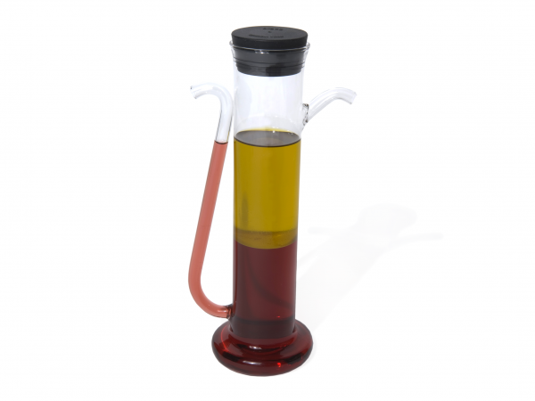
Nowadays Italy is still the Mecca of design, but at that time you could see that some- thing was gradually changing there. The Memphis group was over its peak and Dutch design started to enter the frame. Dutch design is less exuberant, more restrained. There was a clash between the Dutch ‘form follows function’ and Memphis. That difference in approach also became evident when I designed the Salad Sunrise, an oil-and-vinegar bottle, during the initial months that I was in Milan. It’s based on the fact that oil floats on vinegar. I found a producer of laboratory glass who was prepared to execute it. He produced technical glass for the chemical industry and had no experience with consumer products, which also explains why it is more like a piece of laboratory equipment. It prompted many positive reactions. My teachers thought it was a terrific idea as well, but they said: ‘Now you have to develop the form, style it.’ I then experimented with it, but in the end I thought: that form needs to be stripped back to a straightforward vial. To the bewilderment of my teachers
I never used colour, because I thought that if a product being good or bad depended on the colour then it wasn’t a good product. The concept had to be good. That is still a typically Dutch approach.
Initially I wanted to have the Salad Sunrise produced by Alessi, but in the end the company preferred to team up with someone whose name was more well-known. At that time the Alessi collection still had a fairly unfussy character, just like the oil-and-vinegar pourer, but it was gradually shifting towards a more decorative approach: naive, inexpensive, mass-produced plastic articles, made in China.
Icons
Salad Sunrise was eventually produced by Droog Design, a Dutch label established in the early 1990s by Renny Ramakers and Gijs Bakker. They assembled several existing products by designers, including work by Piet Hein Eek, Richard Hutten, Eibert Draisma and myself. This resulted in a small collection of totally different designs with a novel formal idiom and logic. There was an obvious correspondence between the approaches of the various designers: an amusing, solid idea that was elaborated into a clear-cut form. Droog Design was instantly more successful than anyone had anticipated and Salad Sunrisebecame one of Droog’s icons.
From here on, I designed many more icons. Over the years, I shifted from functional design based on physical principles, to products on the edge of art, function and physical limits.

